Insurance agency website for Grape Insurance
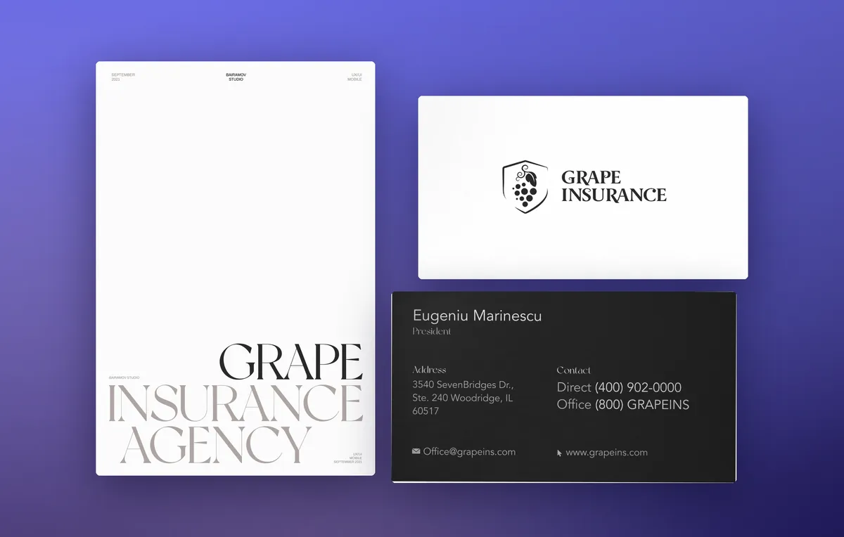
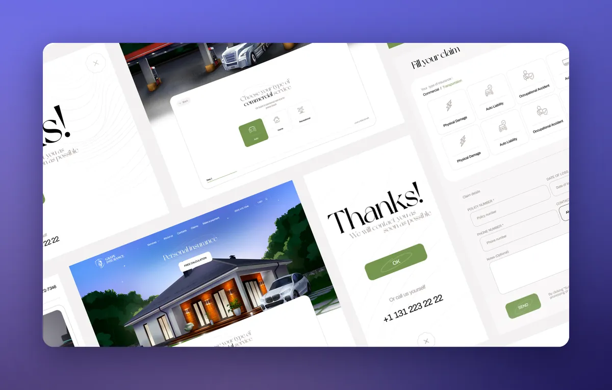
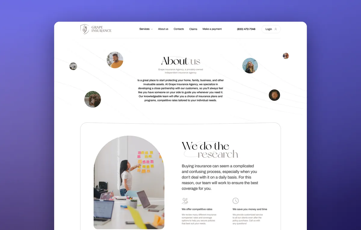
A website for an independent insurance agency in the Chicago suburbs that covers homes, cars and trucking. We designed the logo, brand identity, a series of illustrations and a website with an online quote request.
- Client
- Grape Insurance Agency
- Industry
- Personal and commercial insurance
- Location
- Chicago, USA
- Year
- 2021
- What we did
- Logo, brand identity, illustrations, design, mobile version, development
Try the live website
This is the working build of the home page. Scroll it and the house, the car and the semi truck separate into layers. Open the FAQ, flip through the benefits, switch the view to a phone.
Wheel or trackpad — scroll inside the windowButtons above — switch screen sizesDemo texts come from the English mockup
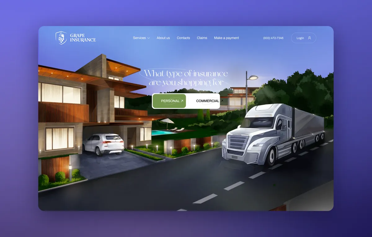
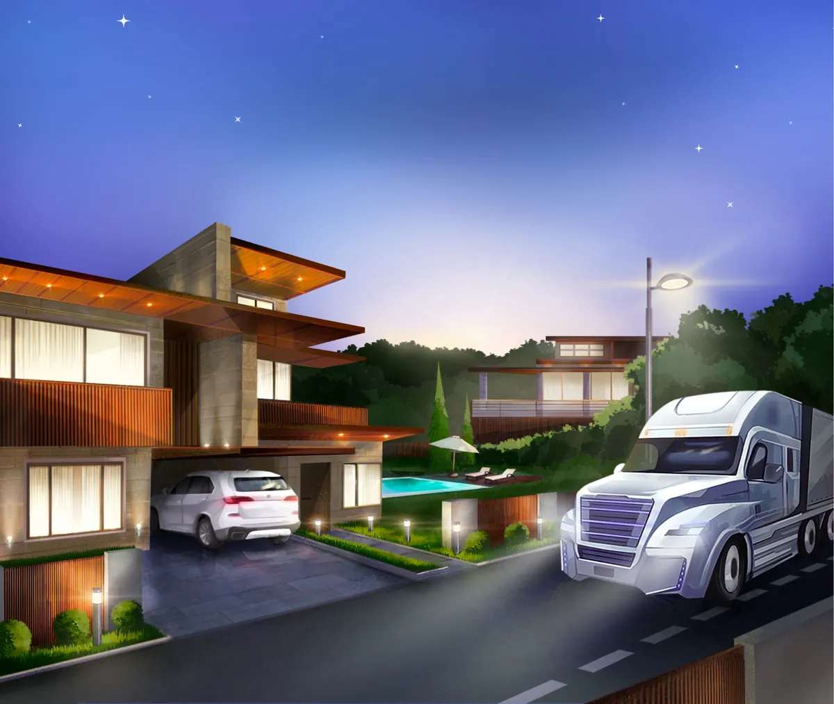
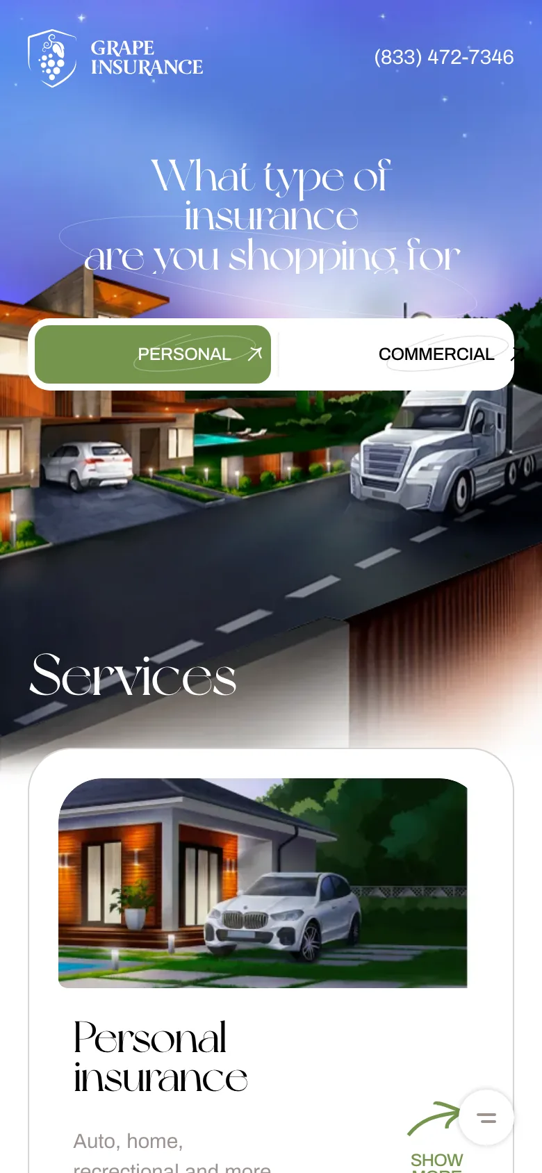
Instead of stock photos — a hand-drawn suburb at dusk with a house, a car and a semi truck side by side
Grape Insurance is an independent insurance agency in Woodridge, near Chicago. It insures families and trucking companies. The challenge: a website that shows who the agency insures from the very first screen and looks nothing like competitors’ sites with stock handshakes.
- 01Preloader and parallaxA grape-cluster logo, then the house, car and semi truck separate into layers as you scroll
- 02A choice on the first screenPersonal and Commercial buttons lead straight to the right type of coverage
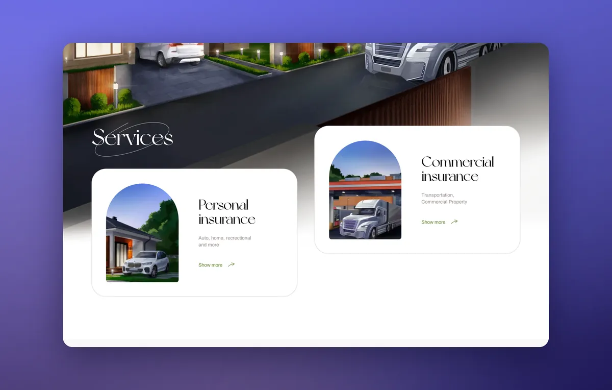
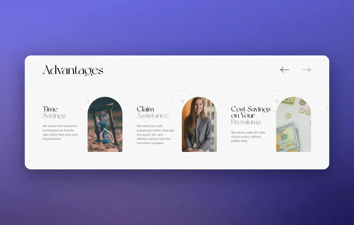
- 03Services and benefitsIllustrated cards and a slider with photos in arches
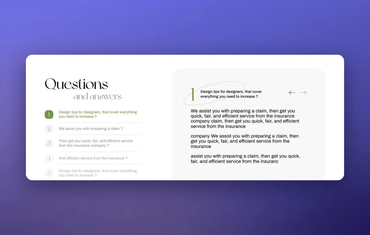
- 04FAQ, quote and claimFAQ, a policy quote and a step-by-step claim form
- Brand identity
- Logo, business cards, letterhead
- Illustrations
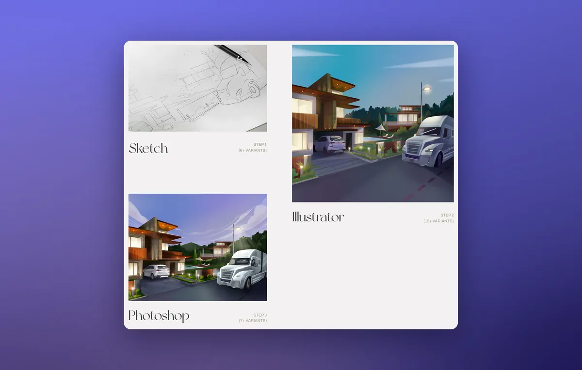
- Illustrator and Photoshop
- Front-end
- Pug, Sass, jQuery, GSAP
- Site language
- English
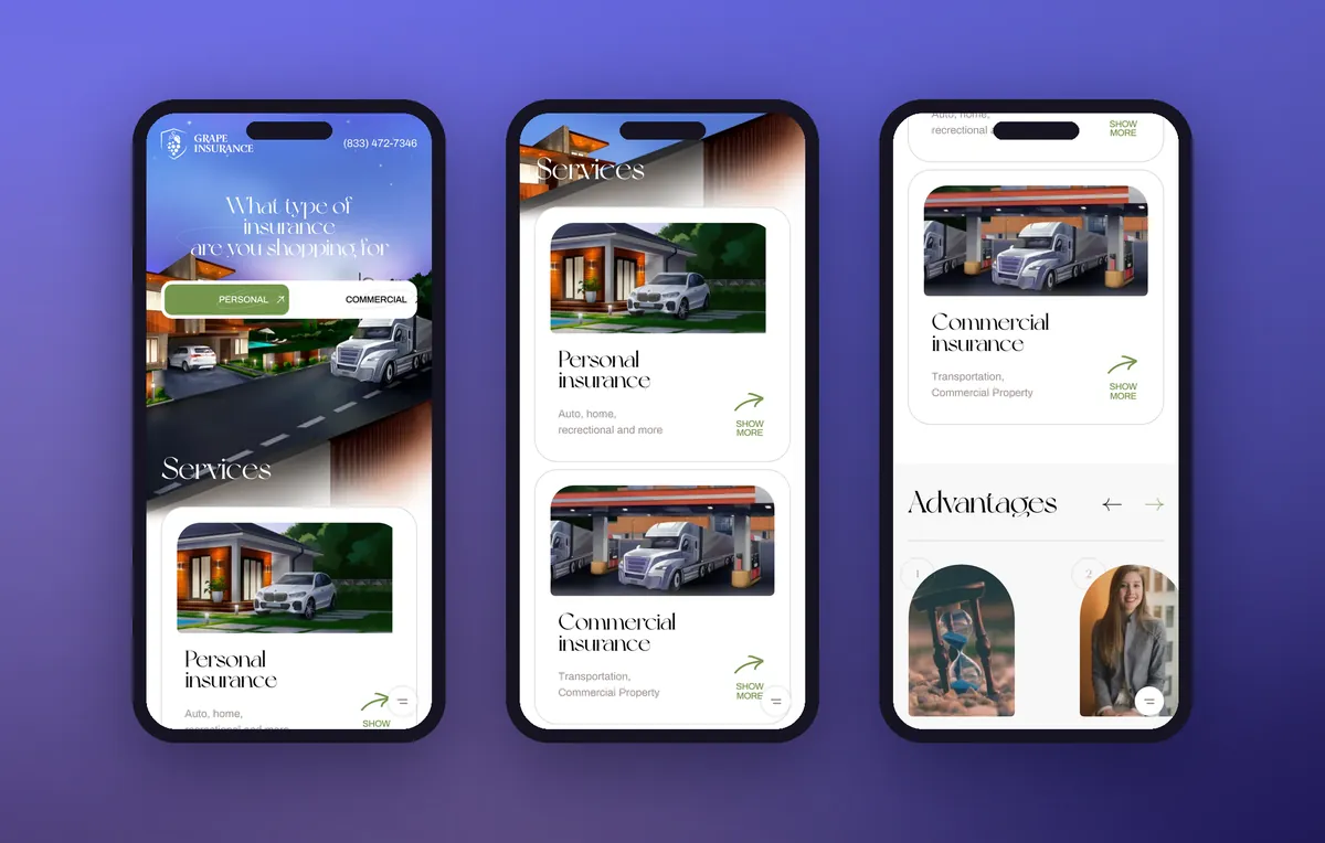
Mobile version — a separate layout
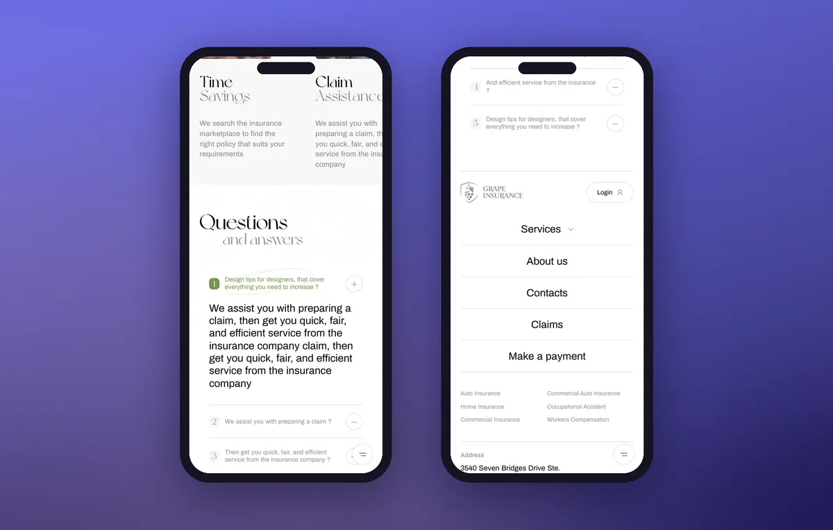
Every block is rebuilt for a phone screen: the hero illustration, service cards, the benefits slider and the FAQ. The menu opens from the bottom, and the agency’s phone number is always in the header.
- 01Custom illustration frames for a narrow screen
- 02Personal or Commercial — right on the first screen
- 03Swipe through the benefits slider
What the website looks like
Tell us your idea.
We handle the rest
What does your company do, and what should the website achieve?