Preschool website for First Steps Montessori
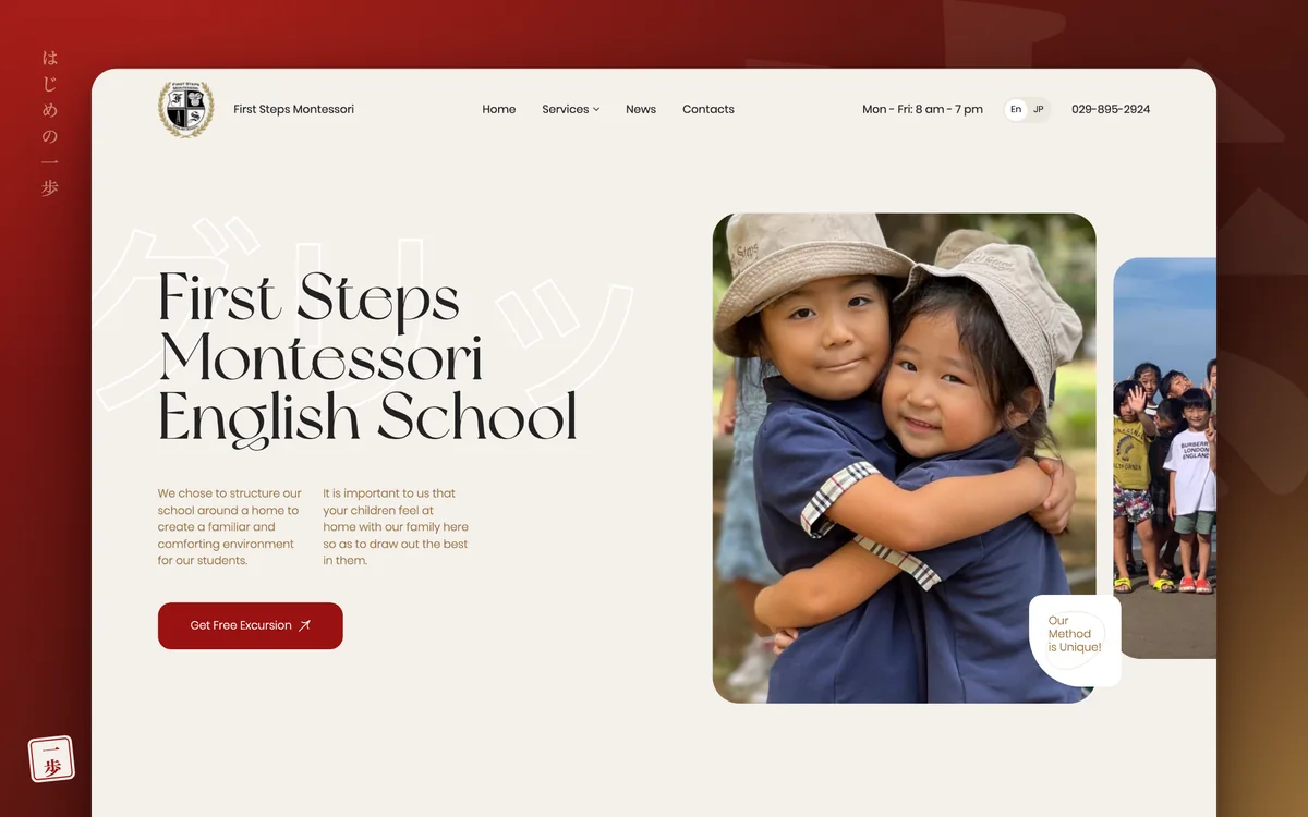
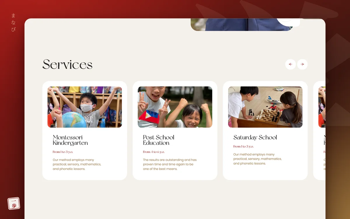
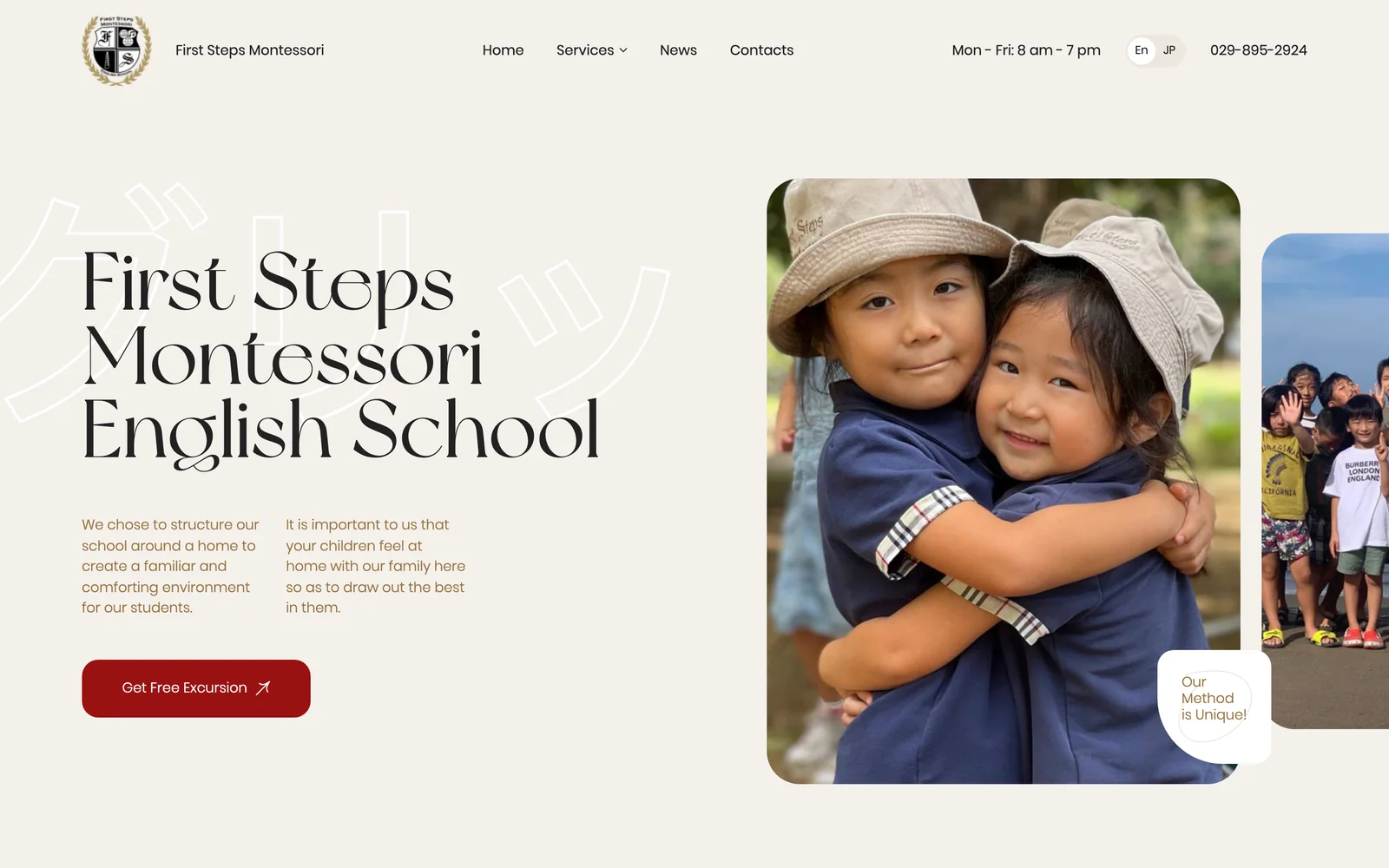
An English-language Montessori preschool and school in Tokyo, Japan. A warm, homey design, real photos of the children instead of stock images, clear programs, a schedule and prices in yen. UX, design, front-end and a WordPress build.
- Client
- First Steps Montessori English School
- Industry
- Montessori preschool and school
- Location
- Tokyo, Japan
- Year
- 2021
- What we did
- UX, design, front-end, WordPress
Try the live website
This is the project’s working front-end. Swipe through the sliders, open the parents’ questions, go to the program page with the schedule and prices, and see the site on a phone.
Wheel or trackpad — scroll inside the windowButtons above — switch screen sizesTabs — home, program, teacher, events2021 version; forms and the language switch are disabled in the demo
A warm, homey site where you’d want to bring your child
First Steps is an English-language Montessori preschool in Tokyo. It follows the North American Montessori Center curriculum and takes children from age one up to elementary school, in groups of up to 15. Both Japanese and international families read the site, so it is bilingual. The goal: convey the school’s atmosphere from the first screen and bring parents in for a free tour.
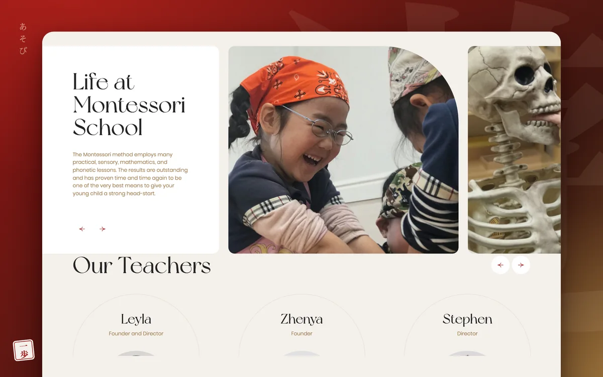
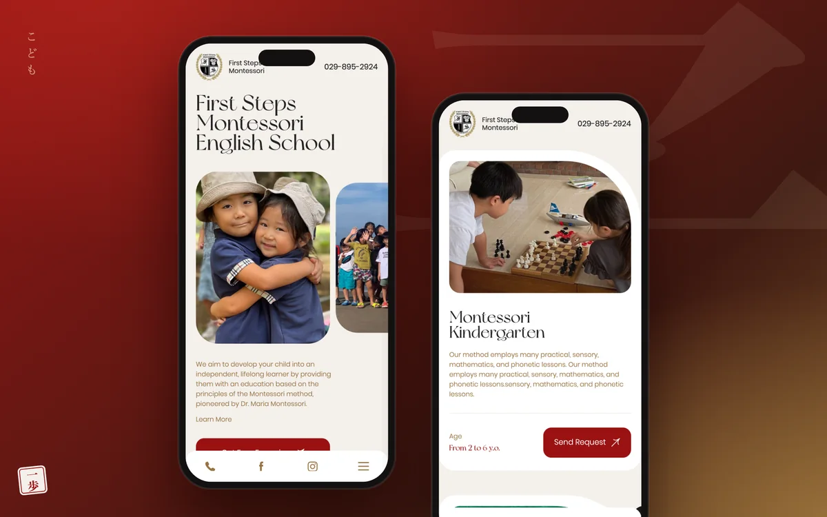
- 01Collage hero screenReal photos of children in soft shapes, a “Free Tour” button and the phone number in the header
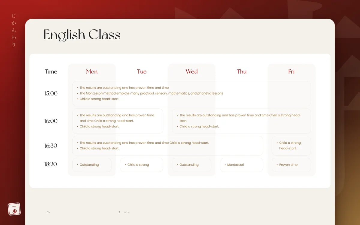
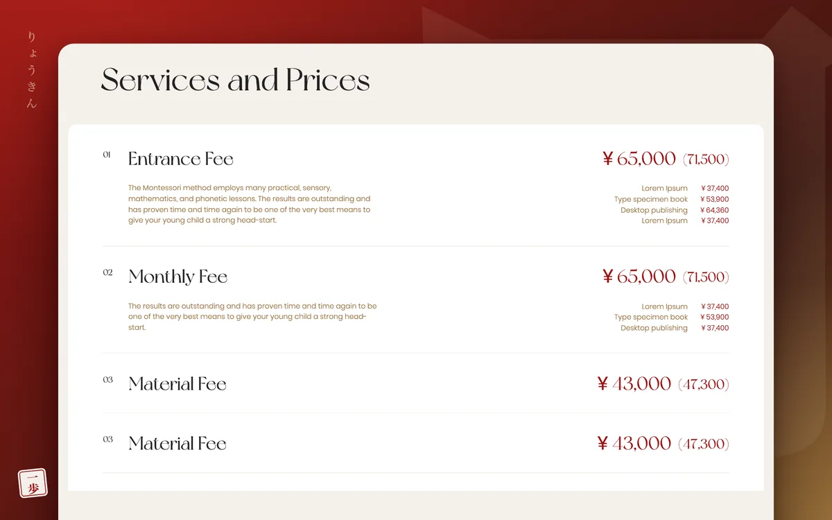
- 02Program pageAge range, gallery, benefits, weekly schedule and prices in yen — everything parents ask about
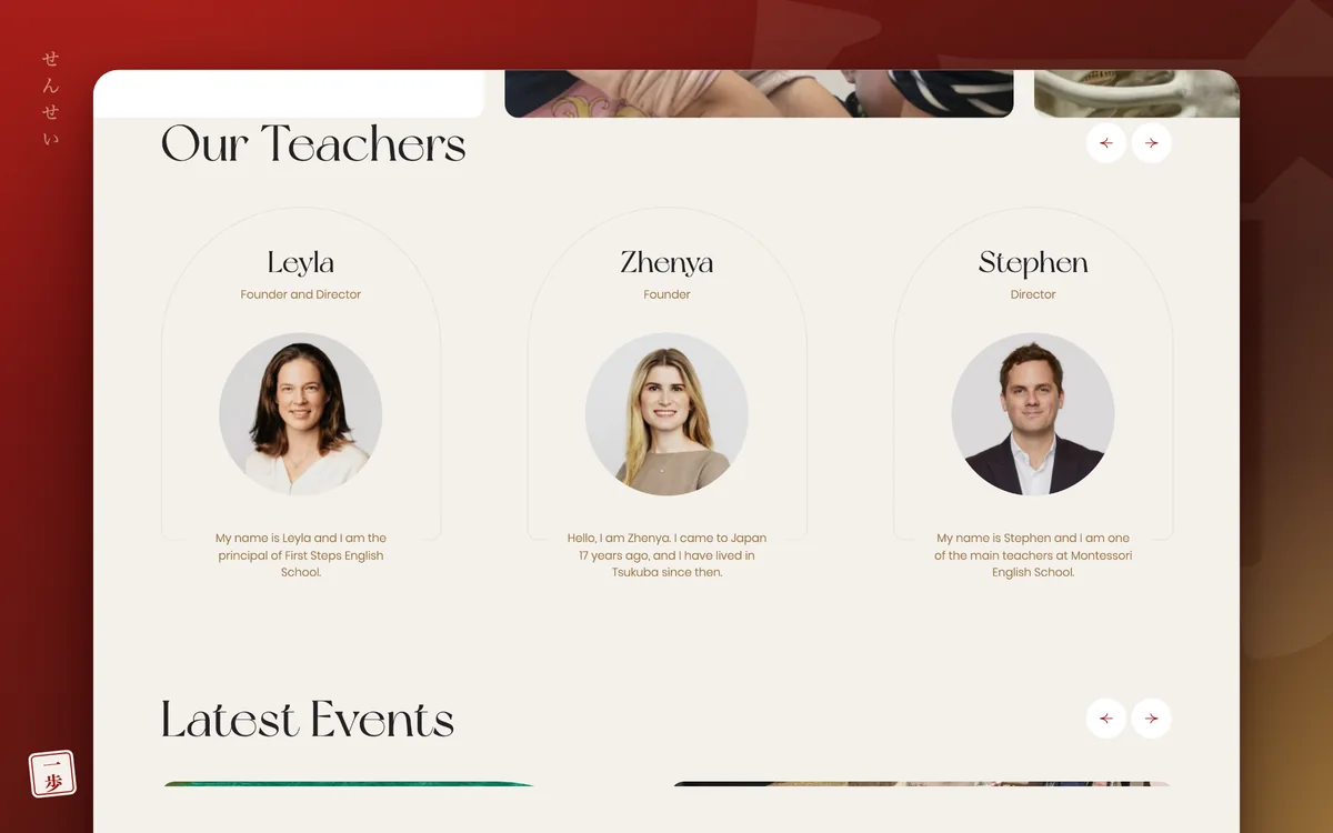
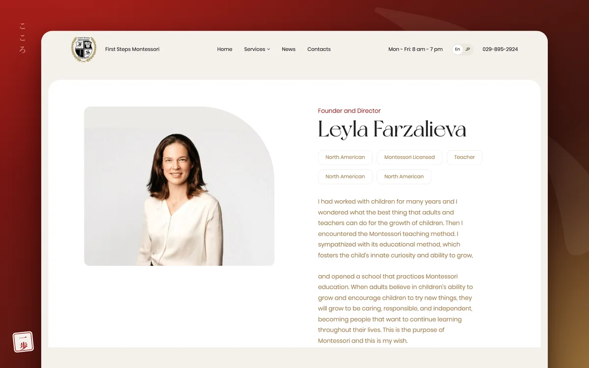
- 03TeachersArch-shaped cards and a separate page for each teacher with their education and story
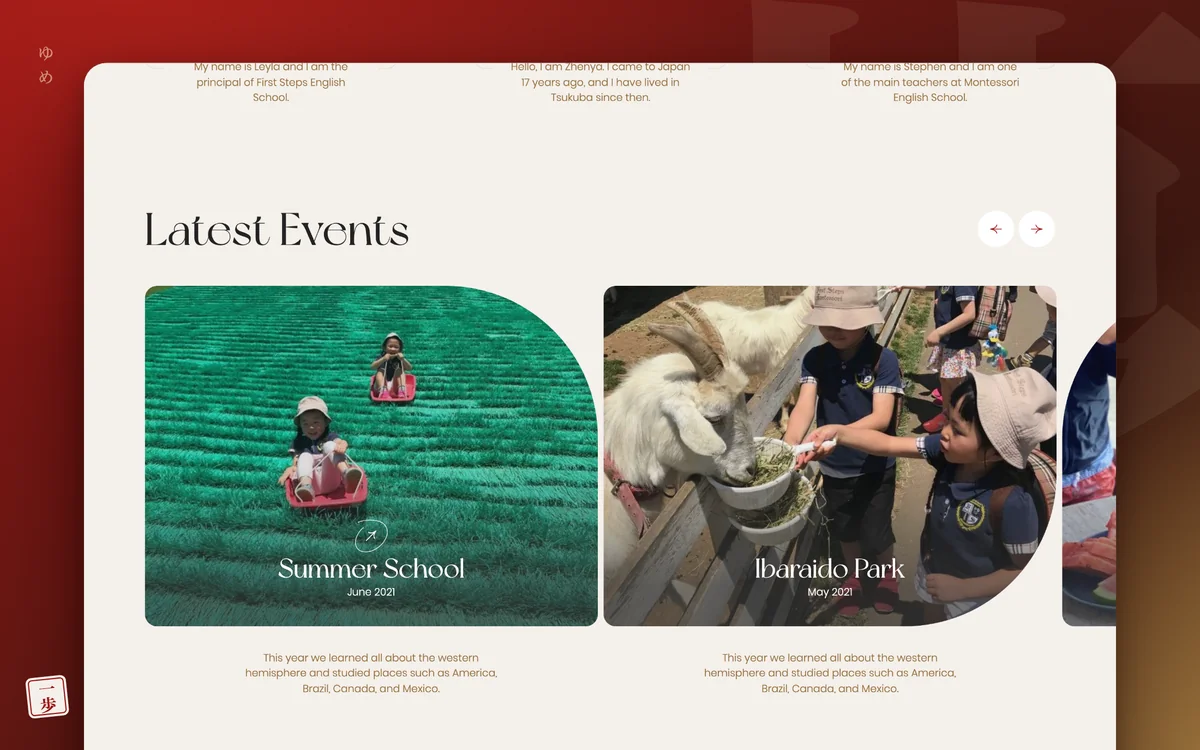
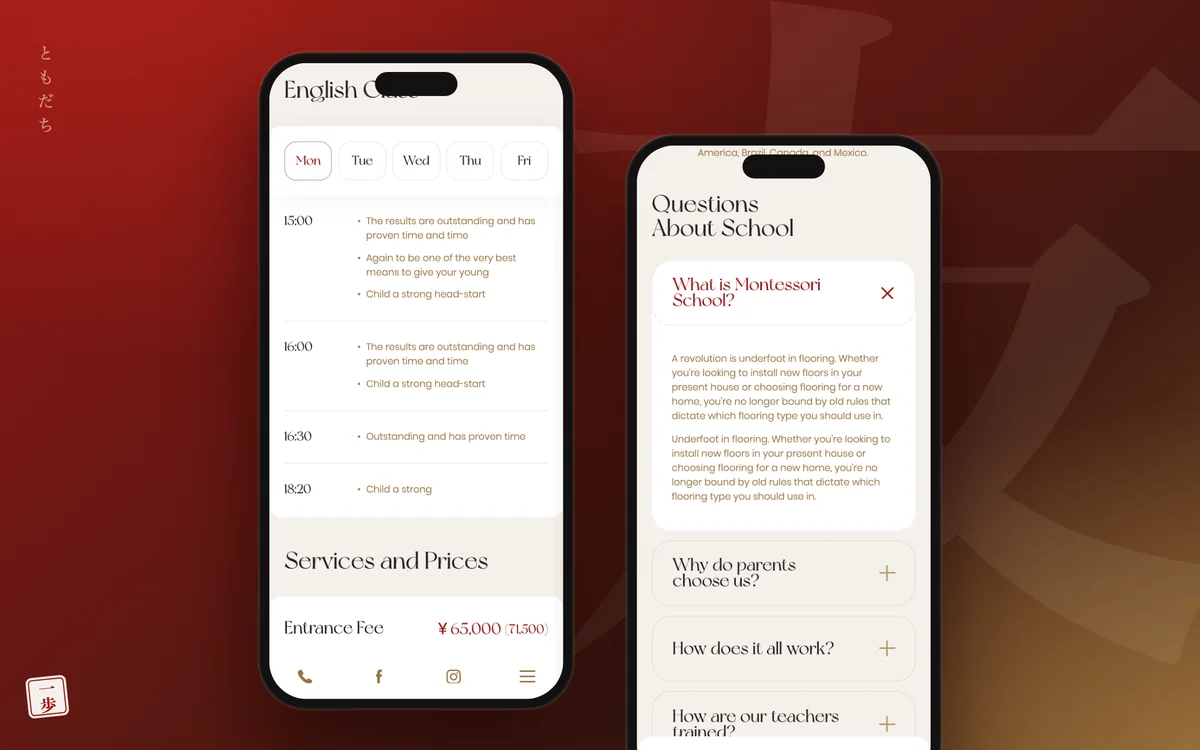
- 04Events and FAQA feed of trips and celebrations, and an FAQ that shows each answer next to the list of questions
- Platform
- WordPress
- Languages
- English and Japanese
- Fonts
- New York and Poppins
- Interface
- Swiper sliders, sections that reveal on scroll
Mobile version for parents on the go
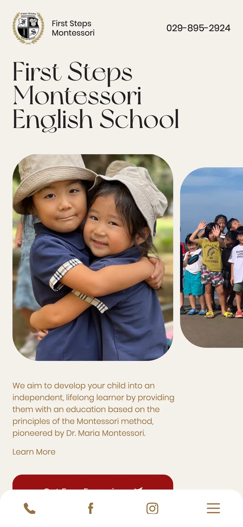
Parents usually open the preschool’s site on their phone: on the way to work or while their child is at the playground. So in the mobile version everything important is within thumb’s reach, and long texts don’t get in the way of the sign-up button.
- 01Call, Facebook, Instagram and the menu in the bottom bar
- 02Long descriptions are collapsed under “Learn More”
- 03The schedule swipes by day of the week
What the website looks like
Tell us your idea.
We handle the rest
What does your company do, and what should the website achieve?