Taxi driver mobile app Ridebook
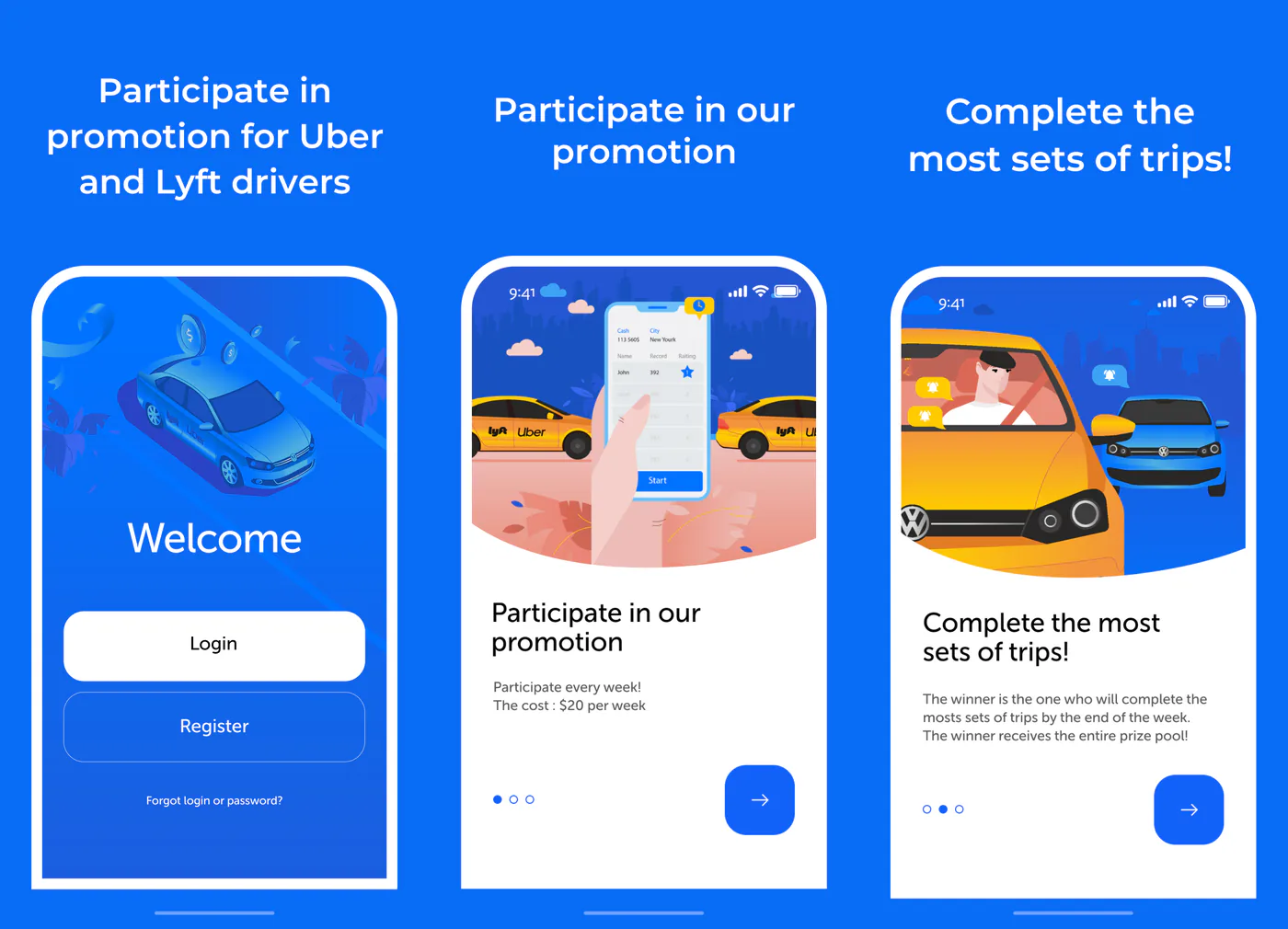
A weekly contest for Uber and Lyft drivers in the USA: a $20 entry fee, and whoever completes the most rides in their city that week takes the prize pool. We designed and illustrated the app, created the animations, built it for iOS and Android and launched a promo website.
- Client
- Ridebook App Inc
- Industry
- Taxi, Uber and Lyft
- Location
- USA
- Year
- 2020
- What we did
- UX/UI, illustrations, animations, iOS and Android app, promo website
Try the live app
This is a working build of the app, compiled from source. Go through the onboarding and sign in: the phone number and password are already filled in. Inside you’ll find the driver profile, the New York leaderboard and support. The demo data is made up.
Buttons — jump to a screenThe interface is in English: the app is for drivers in the USA
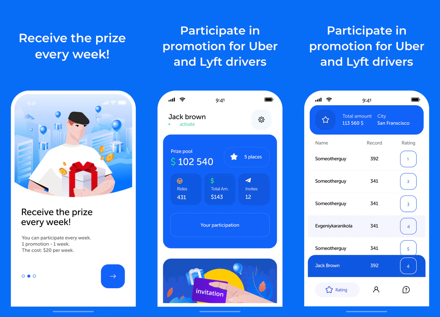
A contest for taxi drivers where rides sync from Uber and Lyft and your leaderboard position shows up instantly
Ridebook is a US startup for taxi drivers. A driver pays $20 a week, the entry fees in their city add up to a prize pool, and whoever completes the most rides takes all of it. The challenge: a simple app with one-minute sign-up, Uber or Lyft account linking, a live leaderboard and prize payouts.
- 01Onboarding and sign-upThree screens explain the rules, followed by sign-in with a phone number and an SMS code
- 02Uber and Lyft linkingRides sync from the driver’s account, with nothing to enter by hand
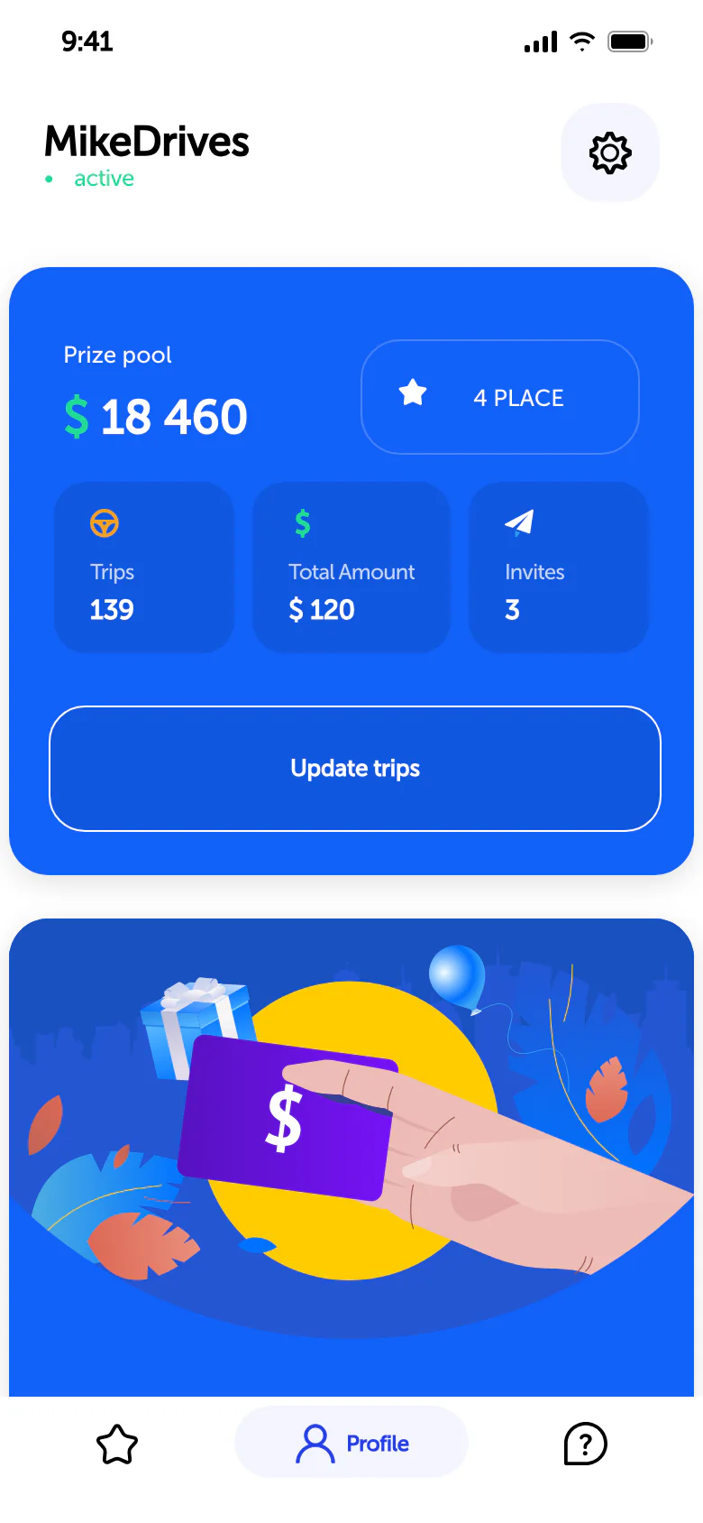
- 03Profile and leaderboardPrize pool, city rank, rides and invites — on one screen
- 04Prize payoutThe winner fills out a form, and the company mails a check
- 05InvitesA driver’s promo code earns $5 for every friend who pays the entry fee
- Platforms
- iOS and Android
- App
- Ionic, Angular, Capacitor
- Server
- ASP.NET and SQL Server
- Languages
- English, Russian, Spanish
Animations instead of static images
The splash screen, the taxi pulling in on the sign-in screen and the weekly results are built in Lottie: lightweight vector animations that stay equally sharp on any phone. Tap a screen to watch it again.
Design system
We built a UI kit for the app: the signature blue, gold for money and prizes, the Museo Sans typeface and a set of buttons. Both the app and the website are built on it, so they look like one product.
Create a password for your account
Headings 25/27, body 13/17: compact, so everything important fits on the screen without scrolling Ridebook
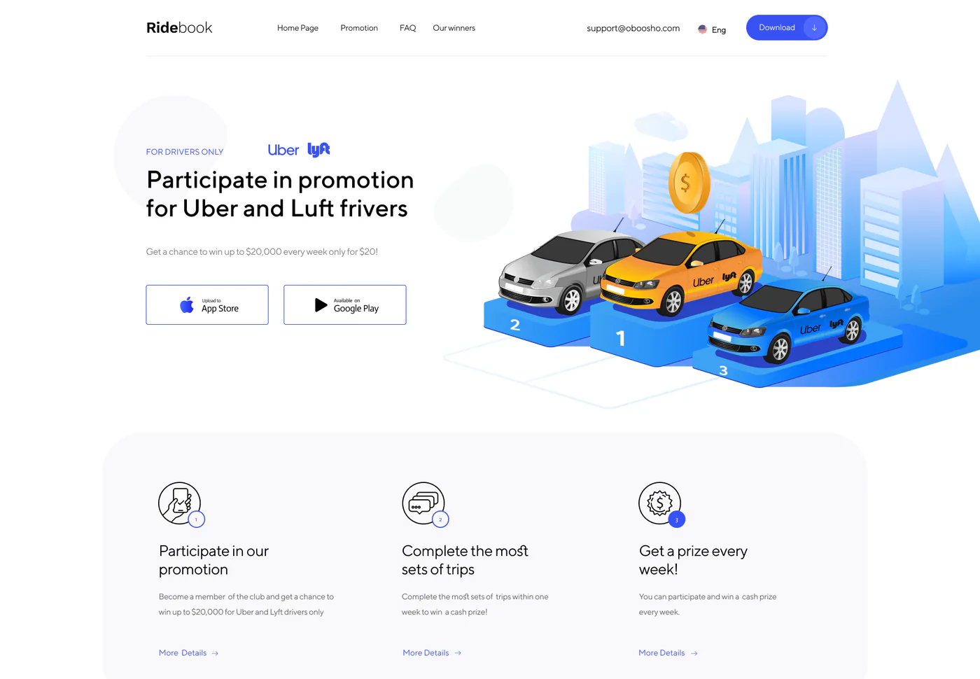
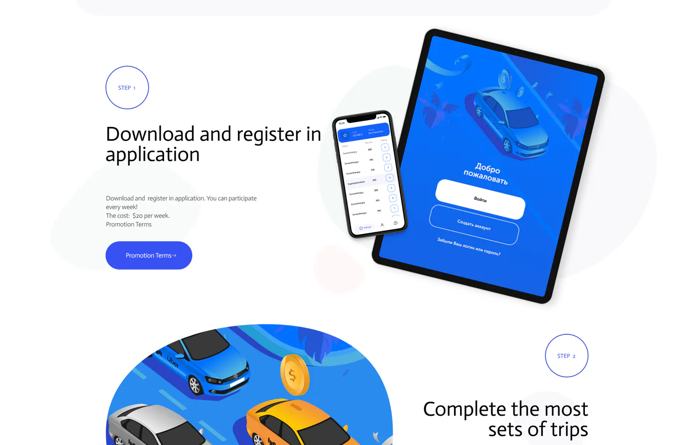
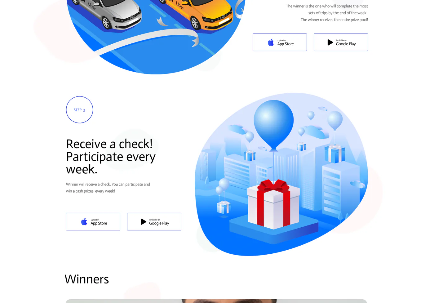
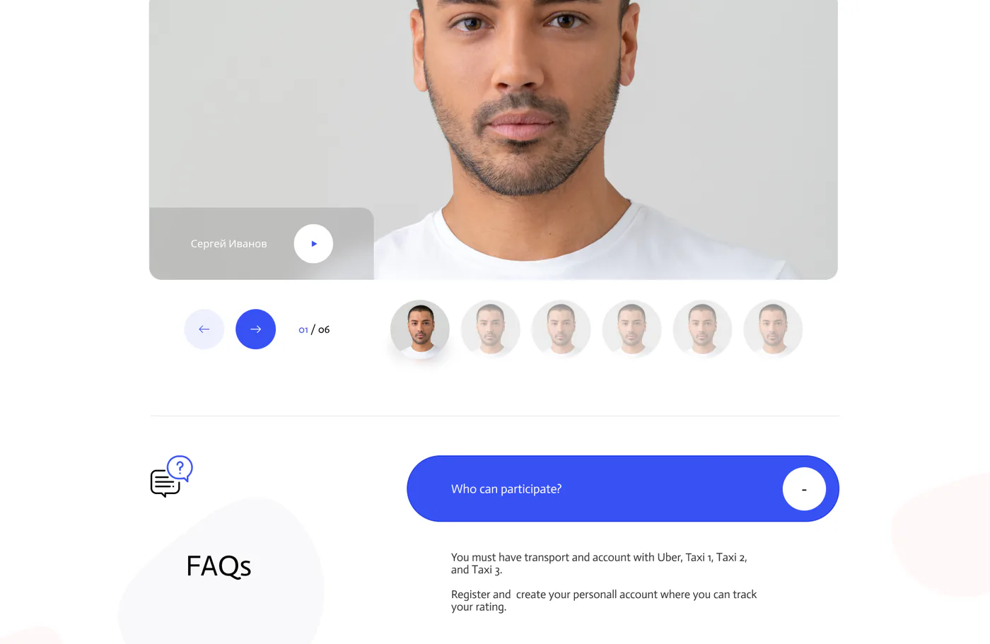
The promo website, live
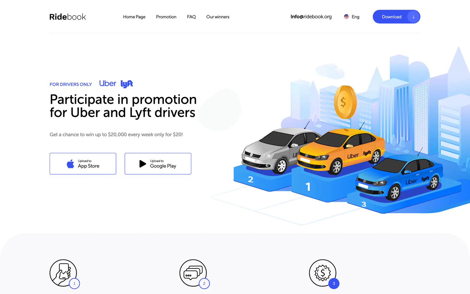
The ridebook.org landing page brought drivers into the app: isometric illustrations, scroll animation and three languages. Switch the language and view the site on a tablet and a phone.
Wheel or trackpad — scroll inside the windowButtons above — switch screen sizesTabs — English, Russian and Spanish versionsThe “Download” form is not submitted in the demo
What the app and website look like
Tell us your idea.
We handle the rest
What does your company do, and what should the website achieve?